B2B Landing Page Elements That Convert Paid Traffic to MQLs
Message match between ad and landing page is the foundation of B2B conversion.
Here's the fastest way to burn paid budget.
You run an ad targeting IT security buyers. The headline says "Automate enterprise security compliance." Someone clicks. They land on your generic demo page: "The all-in-one platform built for modern teams."
Gone before they read a word. It's like paying for a first-class ticket and landing in the wrong country.
Message match isn't a copywriting nicety. It's the structural bridge between what you paid to say and what the visitor actually sees. When that bridge breaks, everything downstream breaks with it. Most teams keep letting it break, usually because the person who wrote the ad has no control over the landing page.
What it actually requires:
- The page headline mirrors the specific claim from the ad. Not your brand positioning. Not your general value prop. The exact thing they clicked on.
- The sub-headline connects that pain to the specific solution on this page.
- The hero section follows a problem-first arc: here's the pain, here's the fix, here's what you do next.
Dynamic keyword insertion and ad-group-specific landing pages make this scalable. But the principle holds whether you're running one ad group or fifty.
A LinkedIn ad targeting a CFO and a Google search ad capturing "vendor comparison" queries are two completely different intent signals. The CFO cares about board-level risk and ROI framing. The comparison-intent searcher wants to know why you beat the alternatives. One page cannot do both jobs well.
Whoever writes the ad should own the landing page. They're the only ones who know exactly what the visitor was promised.
Headline construction for a high-friction buying context
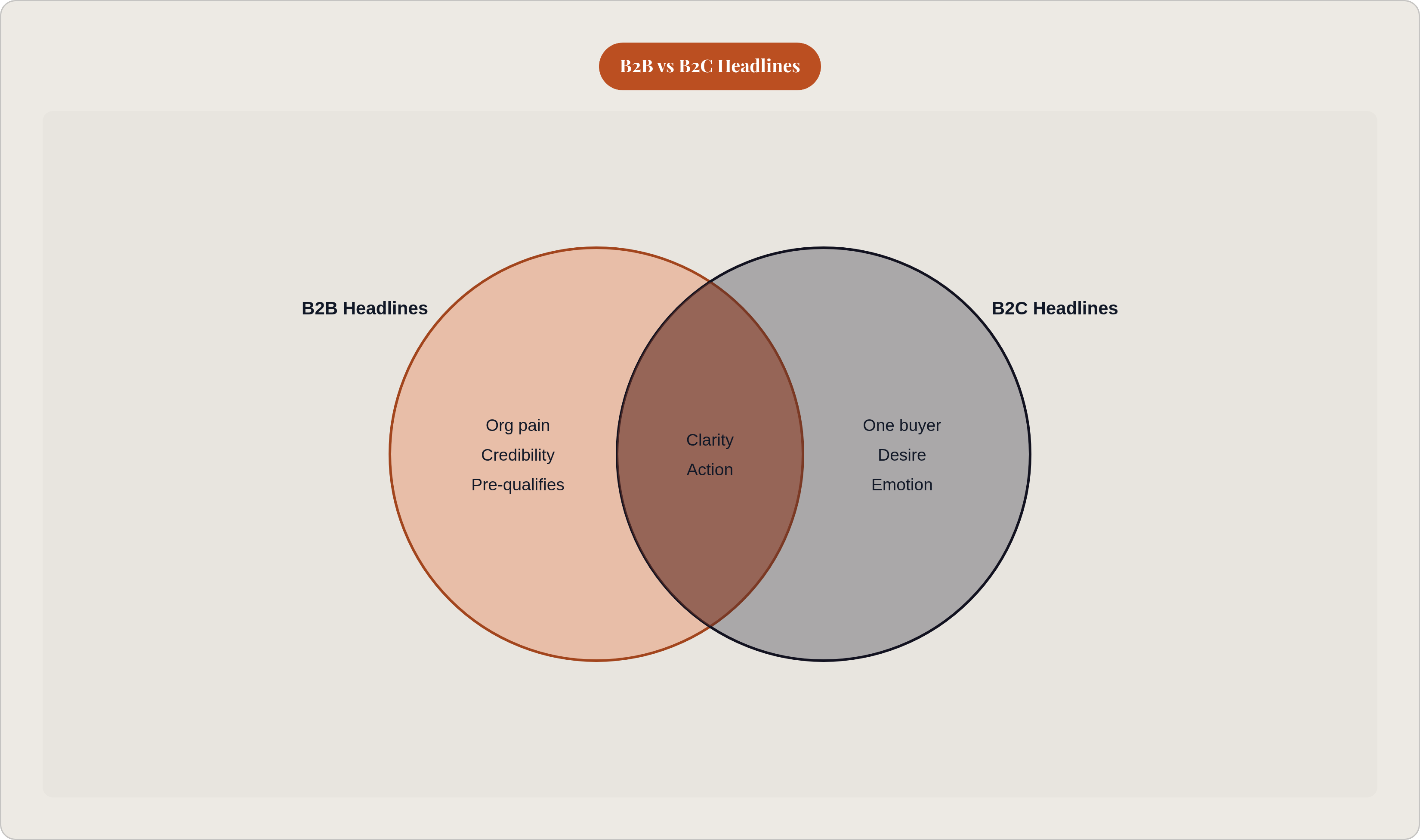
B2B headlines are doing different work than B2C headlines. A B2C headline sells to one person's desire. A B2B headline has to address organizational pain, survive multi-stakeholder scrutiny, and earn credibility from someone who has almost certainly been burned by vendor promises before.
Clever doesn't win here. Clarity does.
The structure that holds up in paid B2B contexts:
- Headline: Names the specific problem or outcome. Concrete. Not "Transform your workflow." More like "Cut security audit prep from three months to three weeks."
- Sub-headline: Explains the mechanism. Not what category you're in. How you actually deliver the outcome.
- CTA: One action. Immediately visible. No ambiguity about what happens next.
Common failure modes worth naming:
- The headline leads with the company name or a product feature the buyer doesn't recognize yet.
- Jargon that signals a category but says nothing about differentiation. "AI-powered platform for modern teams" describes hundreds of companies.
- Wordplay that sacrifices clarity for wit. The buyer has a problem and a budget cycle — there's no time for clever.
A strong B2B headline is also doing pre-qualification work. A headline specific enough to resonate with your ideal buyer will also signal to the wrong visitor that this page isn't for them. Raw lead volume drops. MQL quality improves. That's a trade worth making on any pipeline-oriented page.
For demo requests specifically, the headline should imply a next step. Not just a benefit. What the visitor actually gets by converting right now.
CTA design as a conversion architecture decision
One primary action per page. That's the foundation. Everything else is a distraction.
When multiple CTAs compete — "Book a demo" versus "Download the guide" versus "Watch the video" — visitors often choose none.
Placement:
- Primary CTA above the fold, visible without scrolling on every device.
- Repeated consistently as the visitor scrolls. Not varied, not diluted with secondary offers.
- Social proof placed immediately below the primary CTA, because the moment of highest doubt is the exact moment before clicking.
CTA copy mechanics matter more than most teams give them credit for. "Submit" is not a CTA. It's a dismissal. Action-plus-outcome framing performs better: "Get your pipeline audit" beats "Submit." "Book a 30-minute demo" beats "Contact sales." The specificity does real work. "30-minute demo" signals a defined, bounded commitment. "Contact sales" signals an open-ended process the buyer can't control, and that uncertainty kills conversions.
First-person phrasing consistently outperforms second-person in testing. "Show me my results" outperforms "See your results."
Visual design is conversion architecture, not decoration:
- The CTA button must visually dominate the above-the-fold area. Color contrast, size, and whitespace all contribute.
- Every element competing with the CTA for visual attention is pulling probability away from conversion.
Remove the navigation menu from dedicated landing pages. Every nav link is an exit. If you paid to get someone to this page, a nav menu is just a collection of off-ramps you built yourself.
Form design and the tradeoff between friction and lead quality
Here's the tension at the center of every B2B form conversation.
A longer form collects more qualification data upfront. A shorter form generates more submissions. Which one actually produces better pipeline outcomes?
Most conversion data points to three to five fields as the range where B2B conversion rates peak. Beyond five fields, each additional question introduces meaningful drop-off. But the instinct to keep forms long doesn't come from nowhere. It comes from sales teams who don't want to waste time on unqualified leads, which is a completely reasonable concern.
The math doesn't always support it, though. A shorter form that generates more submissions of lower initial qualification can outperform a long form that self-selects but suppresses volume. More leads entering a well-run follow-up process can beat fewer "perfectly qualified" leads who never submitted at all.
Multi-step forms and smart field logic solve the routing data problem without making the visitor feel like they're applying for a mortgage. Multi-step forms break an eight-field form into two or three steps. The perceived load drops at each step, and completion rates improve because the visitor has already committed by the time they hit the later fields. Start with the least sensitive information: role, company size, that kind of thing. Asking for email first creates abandonment.
Smart field logic shows or hides fields based on previous answers. The form stays brief while still collecting exactly what sales needs — there's no need to ask everyone the same questions.
Most teams aren't tracking form abandonment at all. Insiteful's research found that a substantial majority of visitors who start a form don't complete it. Partial capture, recording data entered before abandonment, recovers leads that would otherwise disappear entirely.
Progressive profiling resolves the friction-versus-quality tension over time. Enrich lead data across multiple touchpoints instead of trying to capture everything in a single interaction. The first form gets you the lead. Subsequent interactions fill in the picture.
Social proof placement and format for B2B buyers
Think about what a B2B buyer is actually doing when they evaluate a vendor. They're running an implicit risk assessment. "If this goes wrong, does it reflect badly on me? Does it cost my organization real money?" Every objection is downstream of that one question.
Social proof addresses it directly. It externalizes the validation. Other people in roles like yours, at organizations like yours, already made this decision and it worked out.
Placement matters as much as presence. Social proof buried at the bottom of the page is decorating a page that already lost the visitor. Social proof near the form or CTA works because it meets the highest-doubt moment exactly where it lives.
Format hierarchy in B2B:
- Video testimonials outperform text testimonials by a wide margin. The medium signals authenticity in a way a static quote cannot.
- Named, titled testimonials from recognizable roles (VP of Sales, CTO, Head of Procurement) outperform anonymous ones. "A leading enterprise customer" means nothing to anyone.
- Independent review badges from G2, Capterra, or TrustRadius carry more weight than self-reported claims. A specific rating like "4.8/5 on G2" outperforms a vague endorsement because it points to something verifiable.
Enterprise logo placement near the form communicates peer-company adoption as a selection signal. When a buyer sees that comparable organizations have already chosen this vendor, that's not just social proof. It's permission. DocSend is one of the more cited examples of this dynamic, where adding enterprise logos drove noticeably higher conversion rates.
Compliance and security badges like SOC 2 Type II, GDPR, and SSL belong near the form, because that's where the enterprise data-security objection actually surfaces.
Page speed and mobile experience as conversion variables, not technical afterthoughts
A slow page loses visitors before they've read a single word of your carefully constructed headline. And when that happens, the problem isn't the server. It's the pipeline.
Pages loading in roughly one second convert at multiples of the rate of pages that take five seconds. Each additional second compounds the drop-off. It's not linear.
B2B buyers do a majority of their research on mobile. More than half of B2B queries happen on smartphones. Mobile conversion rates run well below desktop rates. That gap isn't inevitable. It reflects pages designed for desktop and then adapted for mobile, rather than built mobile-first from the start.
What mobile optimization actually requires on a landing page:
- Form fields sized for touch input, not mouse clicks.
- CTA buttons large enough to tap without precision.
- Above-the-fold content that renders completely without horizontal scrolling.
- Load time tested on 4G, not just broadband.
Google and LinkedIn both factor landing page experience into Quality Score and ad relevance scoring. A slow, poorly optimized page costs more per click and converts fewer visitors. The penalty compounds in both directions at once, which makes speed one of the few investments that pays off in acquisition cost and conversion rate simultaneously.
What happens after the form submit, and why it undoes good page design
Most conversion analysis stops at the form submit. Most pipeline loss happens after it.
Speed-to-lead is the highest-leverage variable at this stage. Kixie's 2025 research found that responding within 60 seconds of form submission produces a 391% higher conversion rate compared to longer delays. The average B2B company responds somewhere between 42 and 47 hours. A substantial portion takes five or more days.
The vendor who responds first wins the majority of deals. Not the vendor with the best landing page, or the best offer, or the most compelling social proof. The first one to show up.
Lead routing failures are pipeline losses invisible to landing page analytics:
- A well-qualified MQL routed to the wrong rep.
- A lead assigned to a territory that isn't being actively worked.
- A submission sitting in a CRM queue with no notification triggered.
Landbase's 2026 research found that properly scored and qualified leads convert at higher rates than unqualified prospects. Routing mistakes destroy value the landing page already created.
The confirmation experience matters more than most teams treat it. A thank-you page or confirmation email that sets clear expectations ("A member of our team will reach out within two hours") reduces the probability that the prospect shops a competitor in the meantime.
The confirmation sequence can also begin qualification before a human ever picks up the phone. One additional question. A relevant resource. A next step that moves the relationship forward.
A landing page is the front end of a system. If the back of that system breaks, no amount of headline testing or form optimization recovers the pipeline.
How continuous testing compounds landing page performance over time
The performance gap between average and top-performing B2B landing pages isn't explained by one better element. It's the accumulated result of systematic testing across all elements, run over time, with each test informing the next.
Testing variables in rough order of typical impact:
- Form length
- CTA copy
- Headline framing
- Social proof format and placement
- Page speed improvements
- Offer type
One variable at a time. Testing two things simultaneously means you can't attribute a conversion change to a specific element.
Top-performing B2B teams run multiple experiments per quarter. Rather than one big test every six months, they run multiple structured experiments, with a cadence, generating data that builds on itself.
Improve landing page conversion rate and you're lowering cost per MQL without changing a single thing about ad spend or targeting. A 20% improvement in conversion rate is a 20% reduction in CAC from the same budget. Run that improvement across quarters, each test building on the last, and the compounding effect is what separates the teams doing five times the performance from the teams wondering why their ads aren't working.