LinkedIn Carousel Ad Specs and Swipe Behavior Constraints
Technical specs and swipe mechanics that determine LinkedIn carousel ad performance.

Start with card count. LinkedIn's own help documentation puts the range at 2 to 10 cards per ad. One third-party source claims 2 to 20. Ignore that number. Check the actual limit inside Campaign Manager when building the ad, since specs change without much notice, and building to a number you read on a blog instead of the number in the tool is how a whole afternoon gets wasted.
Image specs:
- File types: JPG, PNG, or GIF (non-animated only)
- Max file size: 10 MB per card
- Recommended size: 1080 x 1080 px, 1:1 ratio
- Max dimension: 4320 x 4320 px
- Feed render size: images get scaled down to 312 x 312 px once they're actually in someone's feed
That last point matters more than it sounds. Whatever looks sharp at 1080 px still has to hold up at 312 px, which is smaller than a postage stamp on most screens. Design at full size, but judge the result at postage-stamp size, because that's the size a viewer actually sees.
On aspect ratio: 1:1 is the only ratio LinkedIn recommends for carousels. Landscape is technically accepted, up to 1.91:1 and a max of 1200 x 627 px, but mixing ratios across cards in the same carousel creates a visual jump every time the viewer swipes. Pick one ratio per campaign and stick with it. This is a structural requirement. It's the difference between a smooth swipe and a stutter.
Video isn't supported in paid Carousel Ads at all. Not even one card. If motion matters to the pitch, this isn't the format.
Text limits are tight, and every character counts:
- Ad name: up to 255 characters
- Introductory text: keep it under 150 characters to avoid mobile truncation; hard max is 255
- Card headline: 45 characters, and it truncates after two lines
- CTA text: 45 characters, whether it links to a URL or a Lead Gen Form
- Destination URL: up to 2,000 characters, and it must start with http:// or https://
Each card can point to a different URL, which is genuinely useful for product-by-product or step-by-step campaigns. But if the objective is lead generation, every card's CTA links to the same Lead Gen Form. No per-card form swapping.
And here's the detail that should change how much time gets spent on QA: once a paid carousel ad is published, the cards themselves cannot be edited. The cards don't. Final review before hitting launch is the only shot at catching a typo, a broken link, or a headline that got cut off mid-word.
Eligible objectives are brand awareness, website visits, engagement, website conversions, and lead generation. Access-wise, publishing requires super admin, content admin, or Sponsored Content poster access on the Page, plus creative manager access or higher on the ad account.
Organic document post dimensions and the safe-zone margin that keeps text readable in the feed
For document posts, the recommended size is 1080 x 1350 px (a 4:5 portrait), which uses more vertical screen space on mobile. A 1:1 square at 1080 x 1080 px is the safer bet if the post needs to look right across every device type.
Every slide in the deck needs to match dimensions exactly. Mixed sizes make the deck look like it's jumping around as someone swipes through it, which is not the impression to make thirty seconds into a scroll.
To build one: design in whatever tool works, export the whole thing as a single PDF, and upload it through the document option on a LinkedIn post. Not the image attachment option. That's a different upload path and it won't render as swipeable slides.
Now, the safe zone. Keep text and logos roughly 10% in from every edge, about 100 px on a 1080 px slide. Why? Because slides show up smaller in the feed than they look in the design software. Something that reads fine at full size in a design tool can end up cropped or crowded once it's live.
This isn't just an organic concern either. Paid carousel cards get scaled down to 312 x 312 px in-feed, so anything sitting near the edge risks getting cut off or looking cramped at that size.
One more reminder: paid and organic dimensions are not interchangeable. Paid carousels are locked to 1:1. Organic document posts can be portrait, square, or landscape. Keep the two builds separate in your head, and in your file names.
How swipe behavior actually works: what LinkedIn's algorithm registers and rewards
Every swipe adds to something called dwell time, which LinkedIn's ranking system, LiRank, treats as a signal worth rewarding with more distribution. A single image can't generate that same accumulation. Someone either looks at it or scrolls past. A carousel gives them multiple small moments of attention to add up.
There's a second mechanic worth knowing: someone who scrolls past a carousel without swiping might see it again later, starting from card two. That means carousels get more than one shot at grabbing attention, which single-image posts don't get.
That should change how much weight card one carries. The decision to obsess over the first card isn't just creative instinct, it's algorithmic reality: a weak first card doesn't just lose the click, it can cap the whole ad's distribution before it gets going.
The numbers back this mechanic up directly. A 2026 benchmark report from ZenABM put median dwell time for carousel ads at 4.56 seconds, 25% higher than single-image ads (3.64 seconds) and 17% higher than video ads (3.91 seconds). Creative quality already has the standing to close that gap. It's baked into the format. Swiping simply takes more active time than glancing does.
Organic data backs this up. Per a 2026 source tracking LinkedIn engagement, posts that hold attention for 61 seconds or more hit a 15.6% engagement rate, versus 1.2% for posts read in 0 to 3 seconds. That's a 13x gap between a quick glance and a real read, reflecting the same underlying mechanic in which time on the post is the signal the algorithm is watching.
Why the blended CTR understates carousel performance, and what card-level data reveals instead
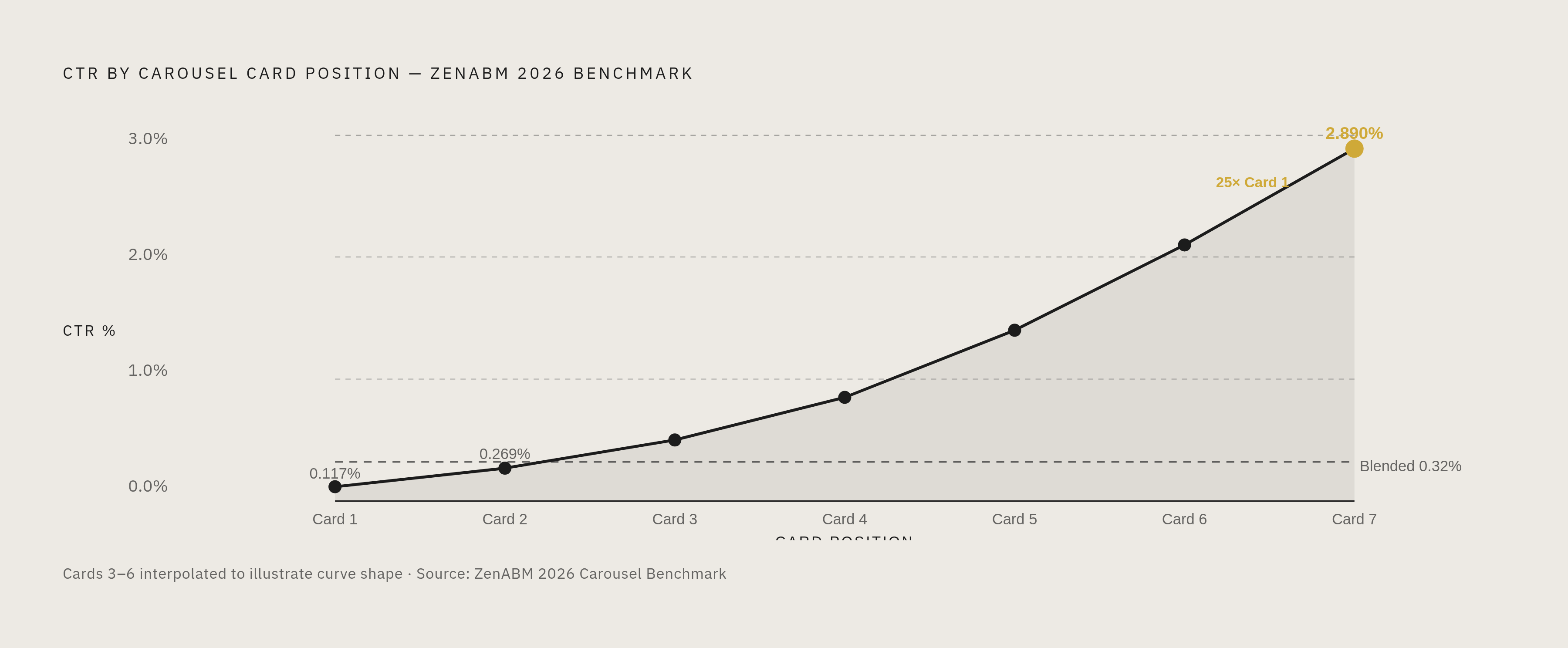
This is where carousels get judged unfairly. ZenABM's 2026 benchmark puts median blended carousel CTR at 0.32%, lower than single-image ads at 0.42%. Read only that number, and carousels look like the weaker format. Stop reading there, and the wrong conclusion gets made.
The blended number hides what's actually happening card by card. Card 1 CTR sits at 0.117%. Card 7 CTR is 2.890%. That's close to a 25x difference between the first card and the seventh, the real story the blended average buries.
Why does that happen? Card 2 alone gets 2.3 times the CTR of card 1. The first swipe is the hardest one to earn. Every card after that is being seen by an audience that already chose to keep going, which means the people left by card 7 are self-selected for interest. Higher CTR deeper in the carousel is a consistent pattern. It's intent building as the viewer moves through, made visible in the data.
Cost matters too. Median cost per click on carousels sits at $13.30 (ZenABM 2026), roughly in line with single-image ads. A separate 2025 benchmark from HockeyStack found average LinkedIn CPC topping $15 in competitive quarters, so $13.30 holds up reasonably well against that ceiling. The dwell advantage and the built-in qualification mechanic aren't costing extra.
So judging a carousel by its blended CTR is judging the wrong number. Card-level CTR is the number that tells the truth, and optimizing card 1 for the swipe, not the click, is what the format actually rewards.
The role each card position plays, and why most carousels fail at slide one
Card 1 has one job: earn the swipe. It's not the place to close the sale. A specific, credible claim beats a vague brand statement here almost every time, because the viewer hasn't committed to anything yet.
Most carousels fail before card 2, and it's almost always one of three ways:
- Card 1 is weak. The headline is generic, or the visual looks like every other ad in the feed.
- Middle cards repeat the same idea instead of building on it. A good sequence uses numbered steps, a before-and-after contrast, or a string of specific claims where each one earns the next swipe.
- The final card CTA is vague. "Learn more" doesn't tell anyone what happens next, and it doesn't match the specific promise the earlier cards made.
The cards that follow are where the real value gets delivered, the payoff for that first swipe. This is where an engaged viewer starts forming actual intent to act.
The final card carries the main conversion ask, placed after the viewer has taken in the full sequence. Its CTA should be a direct continuation of what the earlier cards set up, not a generic request bolted on at the end.
If the objective requires a Lead Gen Form, remember every card shares the same form. Since there's no per-card variation, the sequence has to build the case so the form feels like the natural next step by the time the viewer reaches it.
On length: LinkedIn's own best practice is to start with 3 to 5 cards and test upward from there. A 2026 benchmark from usevisuals.com found that 7-slide carousels performed 18% better than any other length tested. The spec technically allows up to 10 cards, but more cards means more production time and more chances for someone to drop off partway through. Ten cards is a ceiling, not a target.
The 45-character headline limit per card sounds restrictive, but it's actually doing you a favor. It forces one idea per card. Treat that as structural guidance rather than a constraint: one sharp claim per slide is basically the format telling you how to build momentum, one swipe at a time.
Visual consistency across cards as a swipe driver, not a branding nicety
When each card looks like it came from a different ad, the viewer has to reorient every time they swipe. That's friction, and friction is where people drop off. Visual consistency functions as a performance driver here. It's a mechanical requirement of the swipe itself.
Keeping background color, font treatment, and logo placement consistent across every card signals that the content was built with a plan, and that there's a payoff worth reaching. It's a small thing that does real work.
The safe-zone discipline from earlier (that 100 px inset at 1080 px) reinforces this too. When logos and text sit in the same spot on every card, the viewer gets a sense of continuity as they swipe, rather than a series of disconnected images stitched together.
Mixing aspect ratios across cards creates a visible jump in the feed layout. Pick one ratio per campaign and hold it across every card, not because a style guide says so, but because a broken ratio breaks the swipe.
There's a structural difference worth naming: organic document posts, since they're rendered from a single PDF, are naturally consistent because they come from one template and one file. Paid carousels, built card by card inside Campaign Manager, need active discipline to stay consistent. A production checklist before launch catches the slip-ups, which matters even more given the no-edit-after-publish rule.
Organic carousel engagement benchmarks and what the platform-wide reach decline means for the format
Document posts post the highest engagement rate of any LinkedIn format, at 7.00% (Socialinsider). Carousels overall average 1.92% engagement, ahead of video at 1.2% and static images at 0.8% (usevisuals.com, 2026).
The bigger picture on LinkedIn, though, is a platform-wide reach decline, and it changes what those engagement numbers mean. AuthoredUp's analysis of millions of LinkedIn posts found median impressions dropped more than 47% between June 2024 and May 2025, from 1,211 impressions per post down to 636.
Against that backdrop, document posts held up better than most formats: down 43% year-over-year, compared to video's 72% drop. The format is still losing ground. It's just losing ground more slowly than everything else, which is a different claim than "the format is thriving," and worth keeping straight.
Top-performing B2B company pages lean into this format more than average pages do. An Oktopost benchmark found the top decile of B2B pages averaging 22.45% engagement, compared to 5.72% for the median page. For SaaS specifically, carousel engagement averages 1.63% (Socialinsider), and software companies using 7 to 10 slides focused on educational frameworks see rates as high as 2.1%.
One number here deserves a second look. Sprout Social found that 51% of LinkedIn users say text posts are what they're most likely to interact with, more than any other format, by self-report. The actual engagement data says otherwise: carousels and documents consistently outperform text posts on measured interaction. What explains the gap? People probably aren't lying. They just don't track their own swipe behavior the way a dashboard does. Stated preference and actual behavior point in different directions here, and the number that should drive a media plan is the one measuring what people do, not what they say they'd click.
A pre-launch QA checklist that the no-edit rule makes non-negotiable
This is the single highest-stakes fact in this whole spec sheet: once a paid carousel ad is published, the cards cannot be changed. A wrong URL, a typo in the headline, a cropped logo, whatever slipped through stays live for the life of that ad. There's no patch, no edit, no quiet fix. This checklist exists for that reason.
Before launch, check every one of these:
- All cards at 1:1, 1080 x 1080 px recommended, with no mixed ratios across the set
- Every image file under 10 MB, ideally compressed well below the maximum for faster load
- Every card headline at or under 45 characters, with no headline running past two visible lines
- Introductory text under 150 characters for mobile, 255 as the hard cap
- Every destination URL starts with http:// or https://, stays under 2,000 characters, and has actually been clicked to test it
- If the objective is lead generation, confirm the Lead Gen Form linked is the correct one, since every card shares it
- File format confirmed as JPG or PNG, any GIFs must be non-animated
- Text and logos sitting inside the safe zone, roughly 100 px from the edge, on every single card
- Card count between 2 and 10, double-checked against what Campaign Manager actually shows at build time
Once it's live, testing is how the format improves. Run two variants with identical cards from position two through the end, changing only the card 1 headline and visual. Once enough impressions come in to read a real signal, whichever variant has the higher swipe-through rate tells you which hook is stronger. Then test the final-card CTA next, and the introductory text after that, one variable at a time. Changing everything at once tells you nothing about which change actually mattered.
For lead generation campaigns specifically, adding one qualifying question, something like company size, current role, or primary need, can sharpen who actually reaches the form, since every card is funneling toward that same single destination.


